Punctuation slider
LEAD DESIGNER • Design research • Interaction design • Usability research (prototyping) • Implementation and production design
Punctuation slider is one of SwiftKey's core input features. It is a dynamic mini keyboard available on the main typing layout. It helps users with quick punctuation entry. I led design work for launching SwiftKey on iOS and during that time I could optimise the slider's design that was already implemented in our Android product.
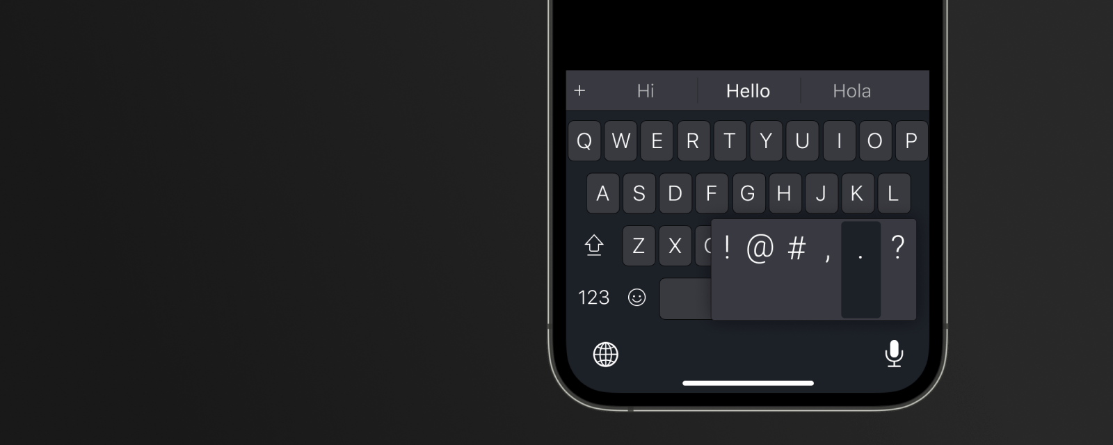
Finished design
Assessing the problem
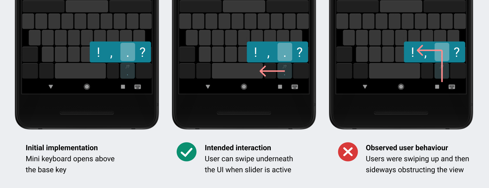
There were some known usability issues with the current design. The slider's UI was opening above the base key, a paradigm borrowed from accent characters mini keyboards for main keys. The intention was that users can swipe underneath the mini keyboard to access the characters, but users were staying ‘safe’ within the UI borders swiping first up and then sideways, which is a much slower way.
I wanted to fix the interaction so that it is intuitive instead of educating users how to use the current UI.
I wanted to fix the interaction so that it is intuitive instead of educating users how to use the current UI.
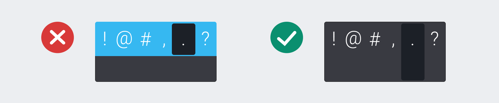
Usability issue with original design
Approach
For this project I had access to weekly testing sessions. I worked closely with engineer to prototype new designs in fully functional keyboard. We needed an actual build instead of a design prototype to test slider interaction in natural typing flow.

Design iterations
We went through three iterations before arriving at the final design. At first, I lowered the mini keyboard to the same level as the base key. The assumption was that if the UI appeared underneath user's finger they will swipe within it.
It didn't work, because this solution introduced another problem. With the mini keyboard on the same level as base key, users were obstructing the slider's content with their finger.
It didn't work, because this solution introduced another problem. With the mini keyboard on the same level as base key, users were obstructing the slider's content with their finger.
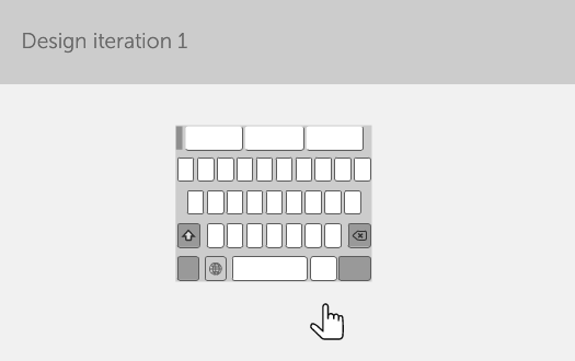
First round
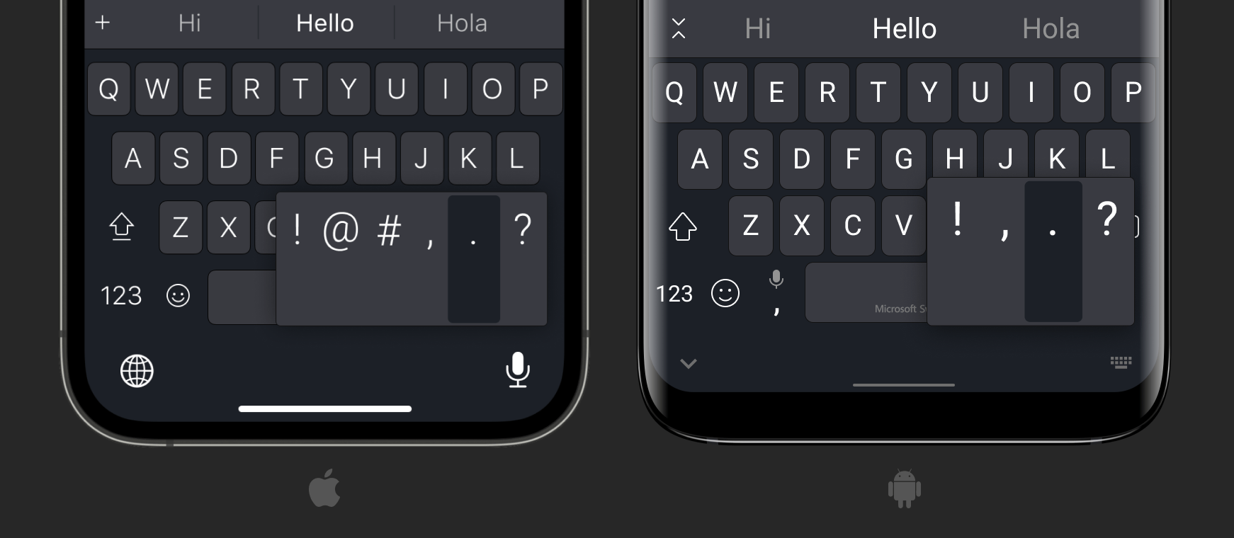
The second iteration was a control test. We implemented slider’s design in iOS layout as it already was in our Android product. At that time SwiftKey Keyboard on iOS wasn’t shipped yet so there was no prior insights from iOS users on that topic.
This testing round confirmed that regardless of the platform, users still struggled to swipe underneath the mini keyboard.
This testing round confirmed that regardless of the platform, users still struggled to swipe underneath the mini keyboard.

Second round
Finally, in the third round, I proposed an extended UI that would cover both the base key and the mini keyboard height. It did look visually odd but it tested great. 5 out of 5 users were able to immediately use the slider.
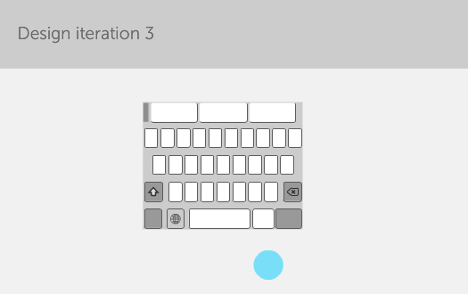
Final design
Visual design in question
Interactions details
Users should be able to get out of the slider without entering any character. I introduced swipe up outside of the keyboard panel gesture for that and used motion design for visual feedback - slider's UI would gently shake to confirm that no character was inserted.
Slider's styling
During design pass for theming I encountered conflict with visual designer that wanted to style the slider so that the top and bottom half had different colours. I felt it would invalidate the whole concept. To resolve the dispute we had this styling tested in another usability round and, indeed users followed visual cues and repeated the original problematic behaviour of first swiping up and then sideways.
Cross-platform release
The improved design was later implemented also in Android product.
V2 sizing optimisation - custom tool building
Once the slider was released we knew that it needed further tweaking to optimise for ergonomics. The height of the mini keyboard was based on the layout based key - it doubled its height. That meant that on tablet devices the slider was too tall and on phones in landscape mode it was too short. I approached this problem with the principle in mind that the swipe distance should be the same across devices.
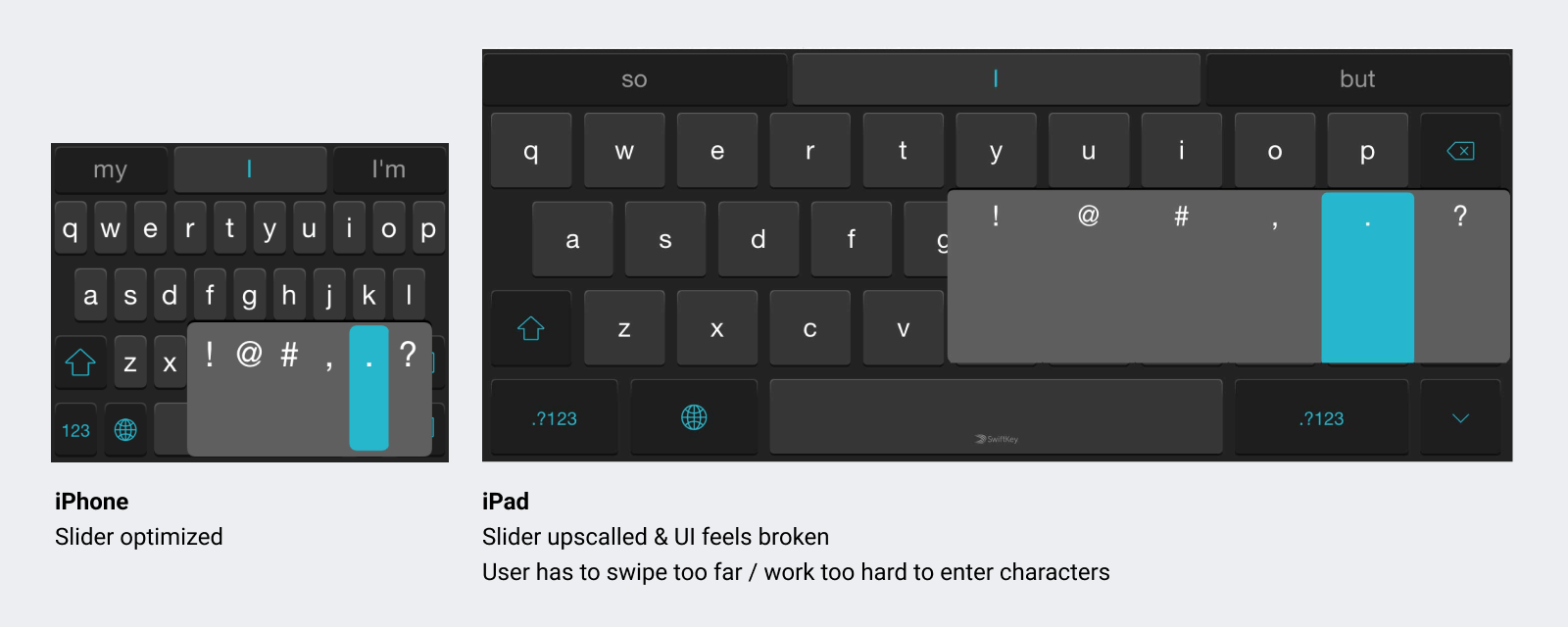
This wasn’t an easy challenge as each device displayed different physical size depending on the screen's density. I couldn't get the accurate size without manually tweaking code and deploying on each device. So, to come up with an actionable design spec I needed to come up with new design tool.
I worked on a custom app, Mobi View, during one of our hackathons. The tablet app would simulate any screen size and density. I could load bitmaps into virtual devices and compare the physical sizes of the slider between them. That way I could give specific values to engineers and have the slider's size appear the same between all devices.
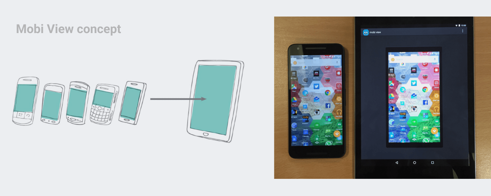
Creating new device
Loading an image
This level of optimisation was done only for iOS devices. Regardless of the device size, orientation or screen density the physical size of the mini keyboard stays the same.
Outcomes:
Feature shipped with iOS keyboard with no usability issues or negative user feedback.
Feature engagement stats proved that users are interacting with the slider to enter characters.
Updated design was also implemented on SwiftKey Android.