Messaging panel
LEAD DESIGNER • Design research • Design sprint facilitation • Content strategy • Interaction design • Usability research (prototyping) • Implementation and production design • Design system input • Overseeing work from junior team members
Messaging Panel is a dedicated space within the keyboard UI that displays messages tailored to users in a form of actionable cards. Each card contains a suggestion that helps users discover new features or adjust their setup for a more optimal typing.
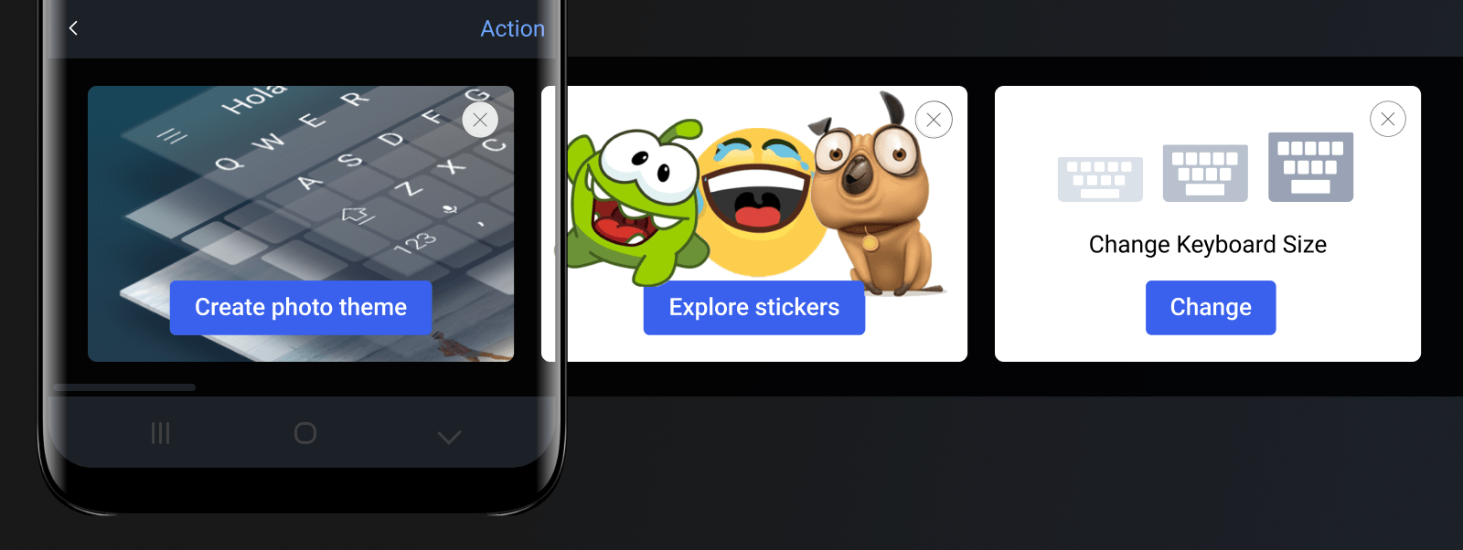
SwiftKey offers range of smart input features and settings. Since they don't always have permanent presence in the keyboard UI it makes it difficult for users to discover and engage with them. I led the design to solve this problem from early research stages through to the implementation phase.
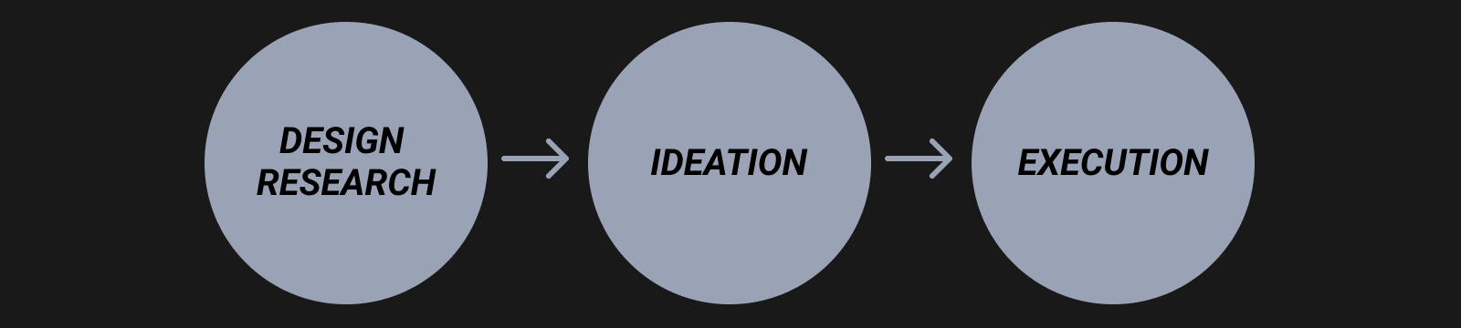
DESIGN RESEARCH STAGE
Problem and Existing UX
The challenge was to find a way to effectively communicate with keyboard users to keep them engaged with the product. Although we had numerous types of messaging flows in the app already, none of them were fit for purpose for the continuous engagement campaigns that we wanted to send out.
Existing messaging UI surfaces
Understanding product context
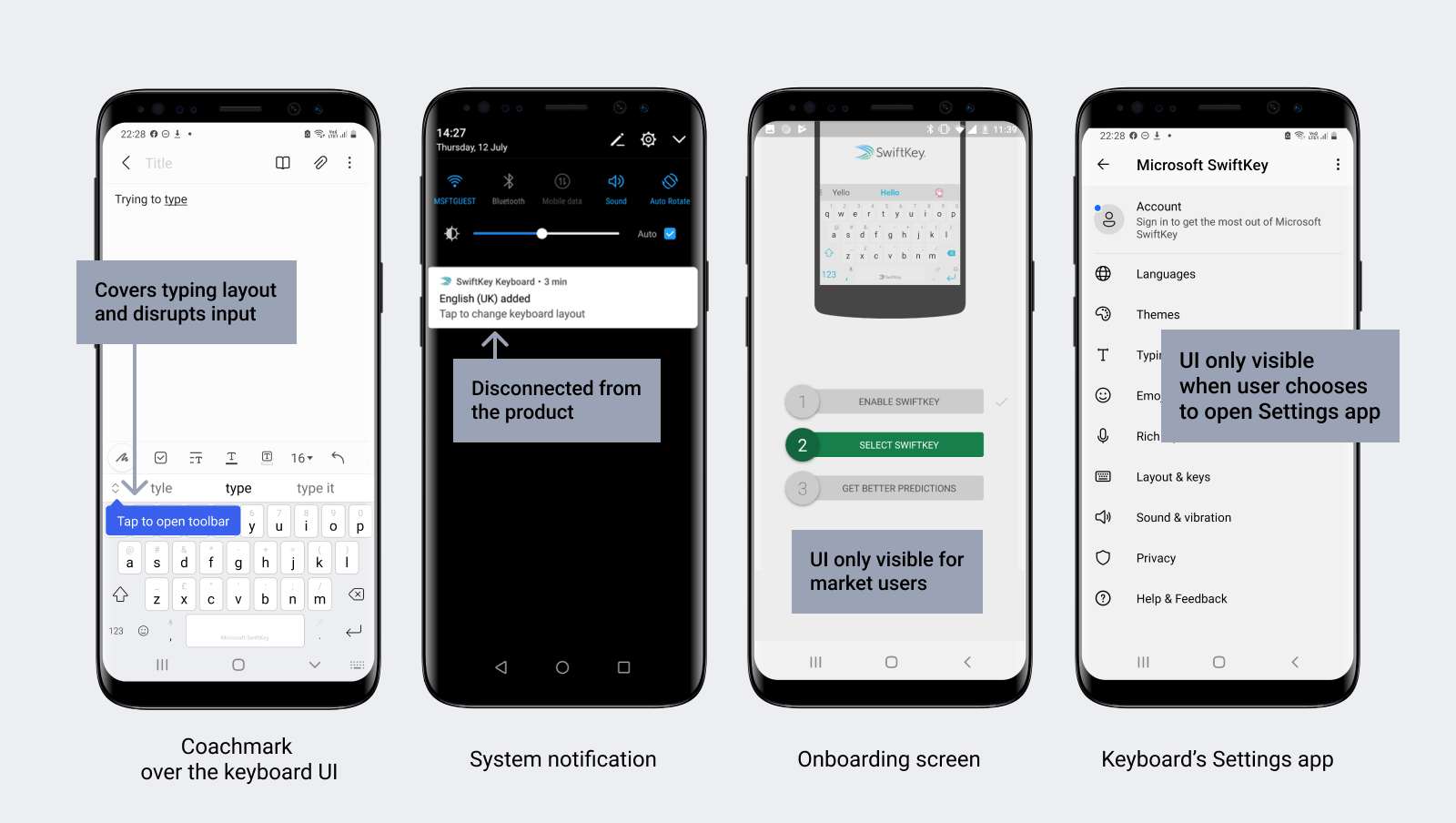
Surfaces external to keyboard UI, like system notifications or onboarding flows, are disconnected from what users see day-to-day while interacting with the product. However, all on-keyboard messaging is disruptive to typing - the main use of SwiftKey. I needed to come up with an experience that would by-pass these challenges.
Existing UX flow styles
Considering users
SwiftKey has two main user groups. Majority have SwiftKey pre-installed on their phones by their device manufacturers; the rest download SwiftKey from the app markets (either Android or iOS). The two cohorts have fundamentally different awareness of the product. Messaging solution had to work for both.
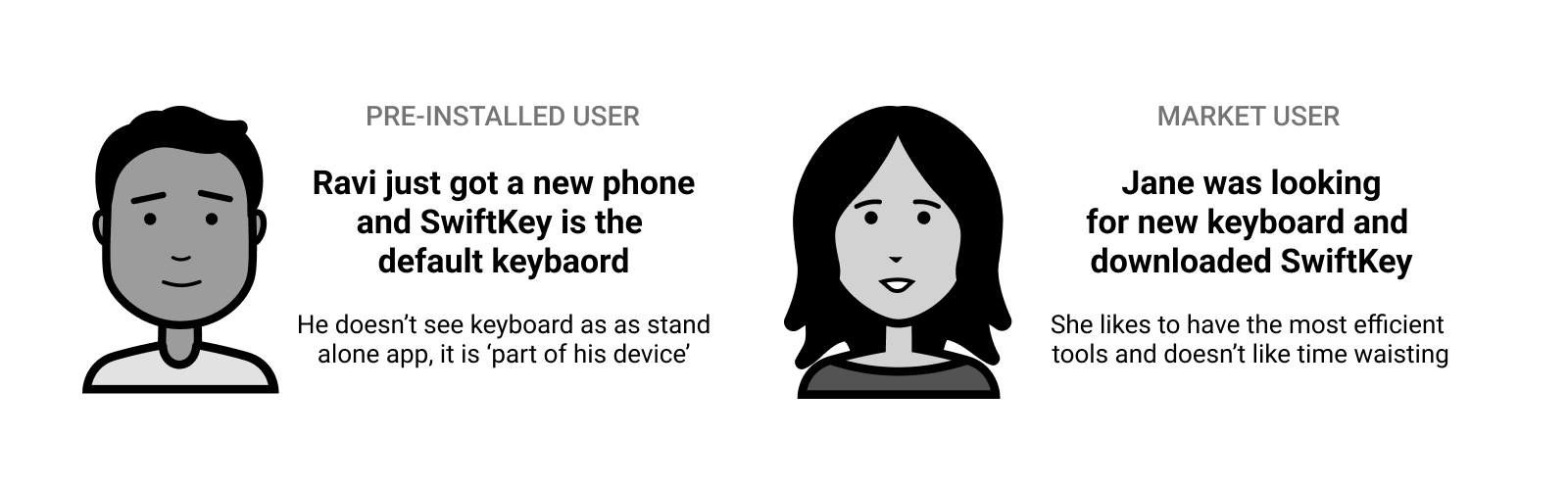
Personas
User journey and existing messaging - UI mapping
I looked at the user journey from the moment SwiftKey is first installed/viewed through to the ongoing product use. And I mapped to this timeline our current messaging interfaces for both groups: market and pre-installed users.
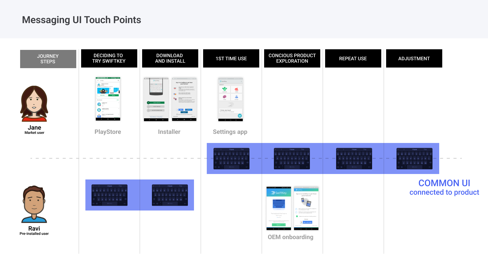
The only common interface that all users saw each time they interacted with our product (post installation) was the keyboard panel, and not the Settings app, where most of our communication at that time was placed. While it is difficult to message users when they are typing, I felt that the solution should 'live' in the main typing UI. I re-iterated to stakeholders the challenges of messaging in the keyboard context and used personas to tell this story.
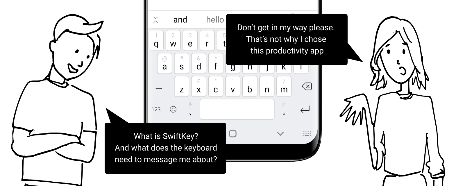
Messaging challenges
IDEATION STAGE
Setting design principles
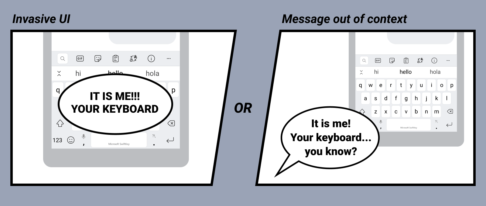
After considering different user needs I came up with design principles statements to help me focus during design ideation phase. Messaging had to be non-invasive, available on-demand, easy to discover and displayed in product context.
Proposed concept - interaction model
With the direction set I came up with the concept of Messaging Panel - a space within the keyboard that is a shell for displaying short, contextual and actionable messages.
Dynamic entry point
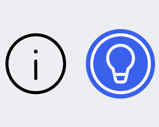
Following the Easy to discover principle I proposed to place an entry point to the panel on the toolbar above the keyboard. It is always there for users to tap into and it has a dynamic, animated state for when there is new content available. The animation was designed by our design intern.
Following the Easy to ignore principle, I designed a timeline for how the animated state appears to make it fade into background after a while, if users don't engage with it.
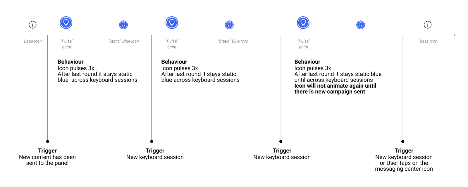
Animation cue timeline
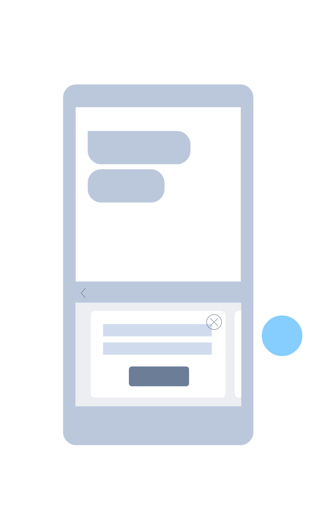
Messaging panel
The panel's structure follows navigation patterns from out team's design system. I extended it to include cards carousel. Users had to be able to estimate how many cards are available and hide/dismiss cards if they no longer wish to see them (Easy to find and dismiss principle).
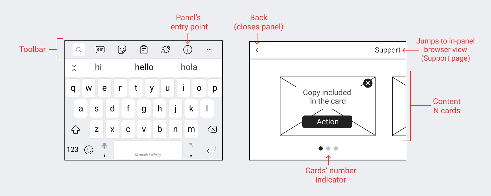
Panel structure
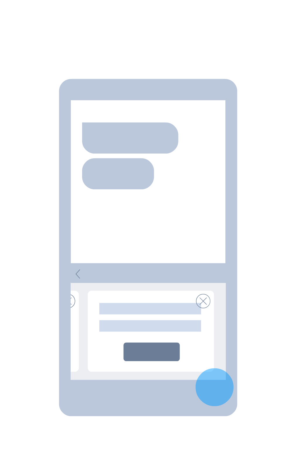
Extended keyboard panel
In addition, we introduced new UI surface - extended window panel. This solution gave us space to display more information, while keeping users in their original flow. Whatever app they were typing into when they opened the panel, is still visible in the background. Tapping back button collapses keyboard to its original size.
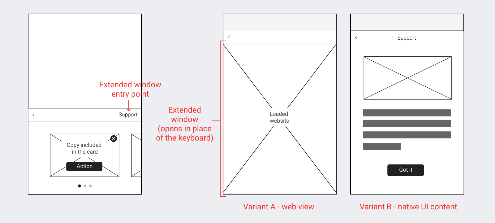
Extended panel structure
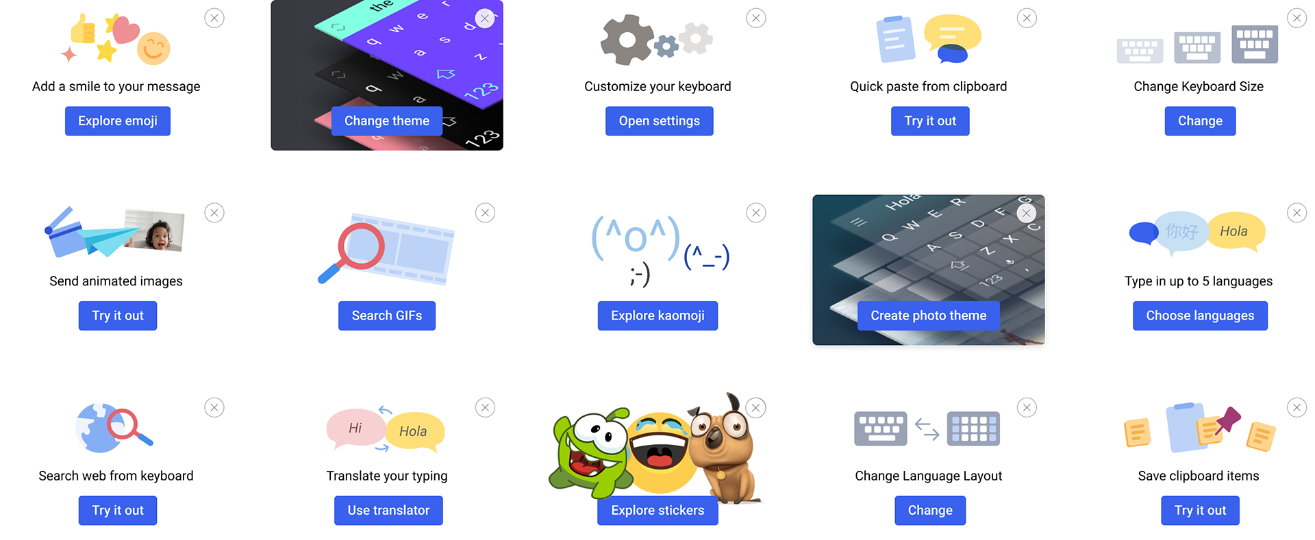
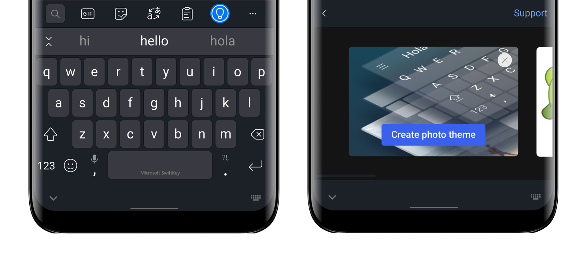
Cards / Content
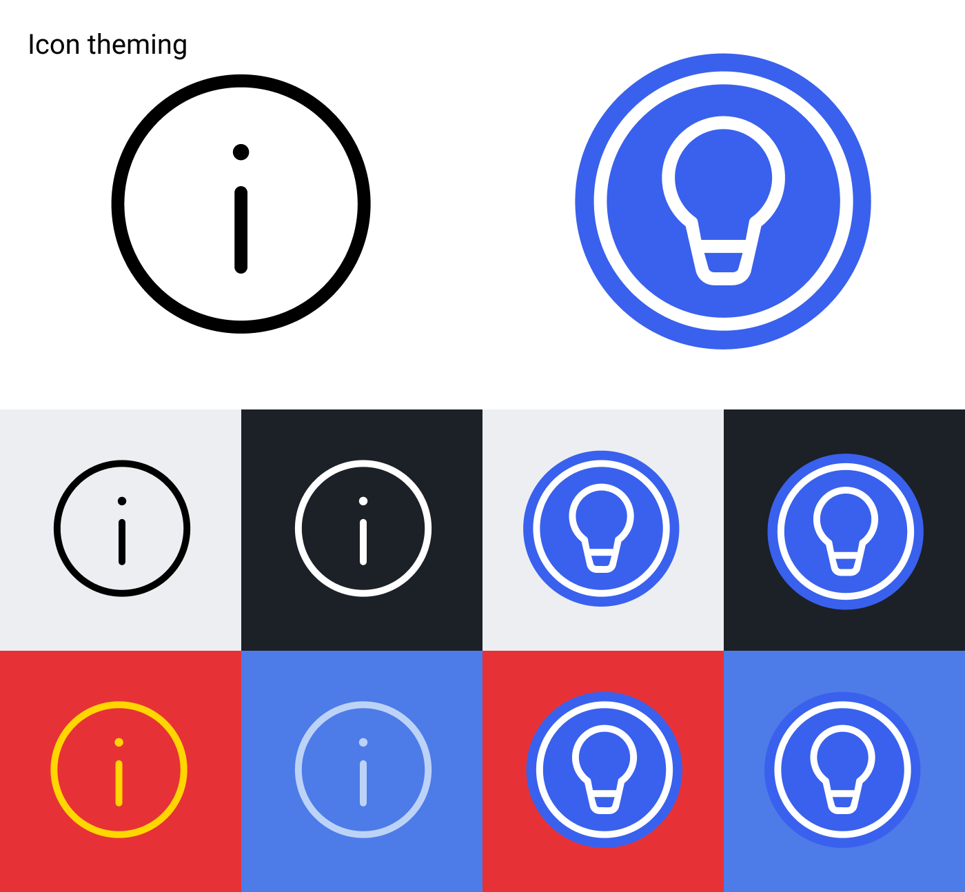
Campaigns, the main content, take form of cards. Each card contains a single message and call to action that triggers relevant guided flow. Choosing card format allowed to contain visual for each message. That keeps it independent of the keyboard theme colouring. It was important to ensure that all messages meet accessibility criteria across themes.
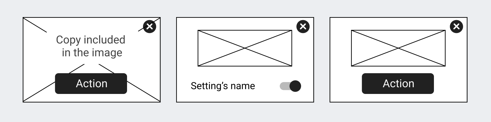
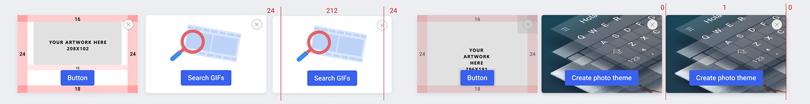
Sample cards' layouts
I ran content strategy workshop to find out what possible scenarios we might want to use the messaging panel for. Participants of the workshop were from Product, Design, Research, Engineering, Marketing, Data and User Support teams. The aim was to come up with speculative scenarios so that I could abstract them into standardised cards flows.
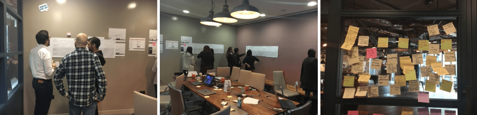
Sample cards scenarios
Core scenarios types
Based on the generative outcomes of the content workshops I categorised cards scenarios into three main types:
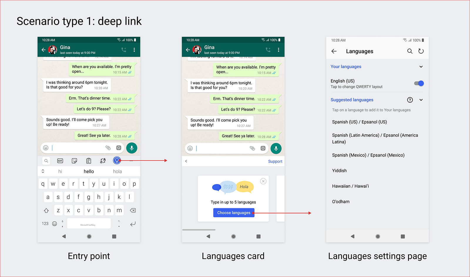
Scenario type 1: deep link Call to action button opens a keyboard panel, page in the Settings app or external web link. This scenario can help users discover new functionality or trouble shoot specific issue users is facing.
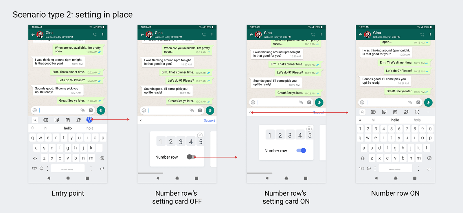
Scenario type 2: setting in place Call to action is a toggle to switch setting on or off. This scenario leads users directly to the settings' control that might be useful to them.
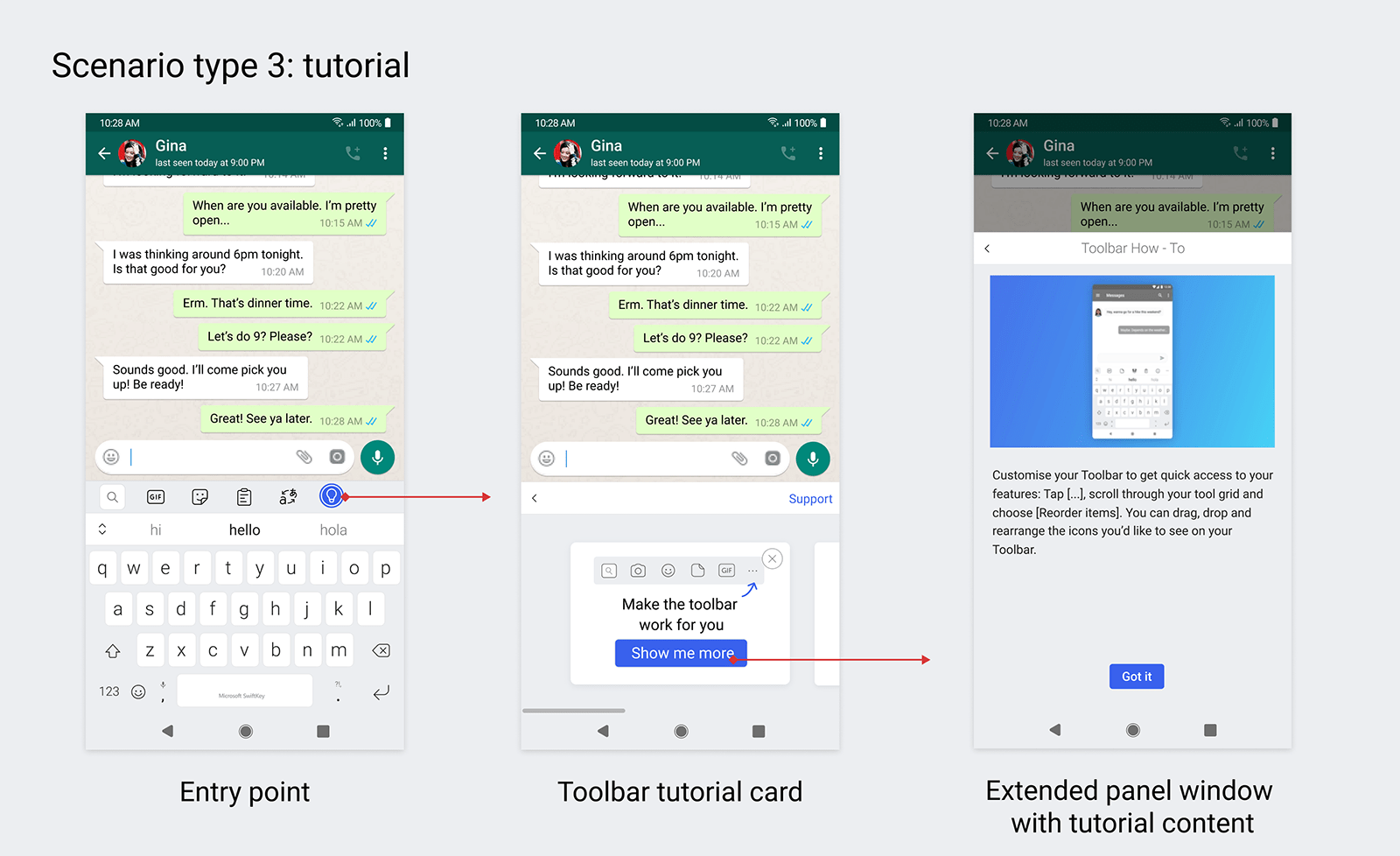
Scenario type 3: tutorial Call to action button opens Extended Window Panel that displays more information related to the card's message. Helps with the detour while keeps users in keyboard and typing app context.
EXECUTION STAGE
Prototyping, usability research and concept validation
I worked with user researcher to test the concept's fit and usability with end users. My role was to ask the research questions I wanted to have answered, contribute to the discussion guide and prepare relevant prototypes for the sessions.
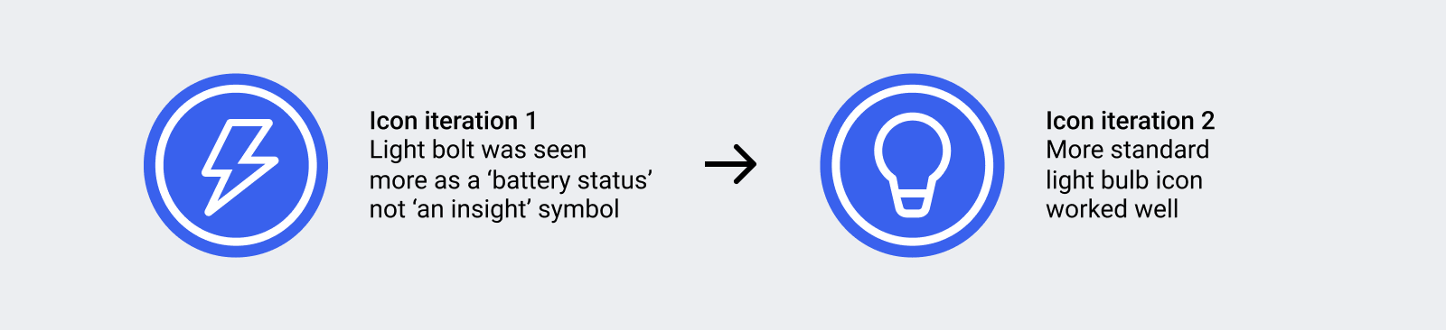
We tested with new and existing users cohorts over two rounds of testing. I watched most of the interviews before receiving the insights report. As a result we tweaked the entry point iconography. We also confirmed that the panel concept was perceived as non-disruptive and helpful, which was the goal - the Non-invasive principle.
Production design
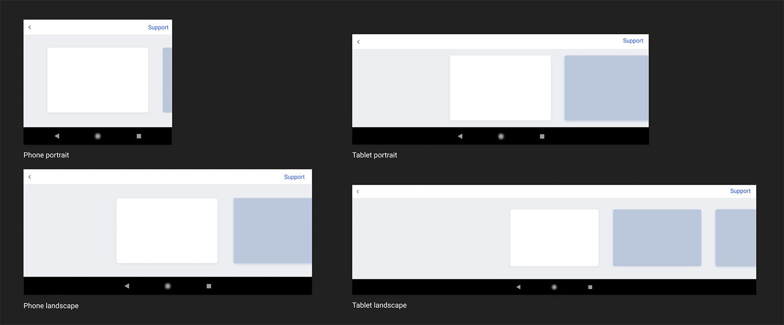
🎨 Prepared UI specs in Figma for both dark and light mode and for various device sizes and orientations.
📐Worked with the lead engineer to define panel's height constraints to avoid displaying content that is illegible or up-sized to the point of UI looking broken.
📖 Documented the card scenarios guidelines. Both, UI and scenarios guidelines were included in our team's design system.
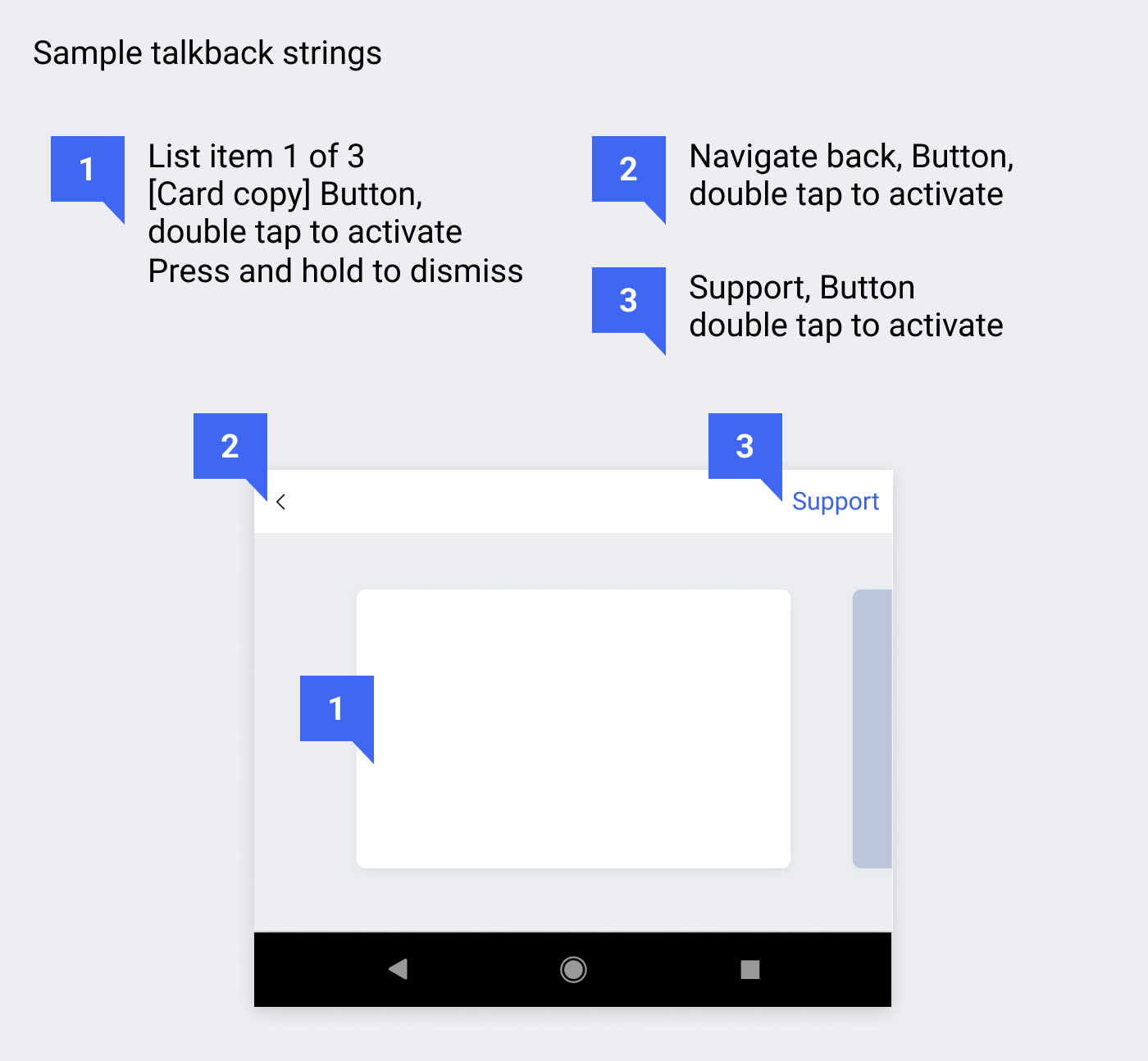
👁️🗨️ Worked with accessibility team to check contrasts, elements ordering, control types labelling and talk back strings.
💬 Collaborated with copywriters to make sure that accessibility strings and the overall copy are consistent with SwiftKey's product as well as overall Microsoft's tone of voice.
🛠️ Delivered assets to developers and QA work in progress APKs.

Outcomes
Feature was shipped to all users across iOS and Android products.
Market data confirms that users are opening the panel.
Proved through in-market experiment that the cards are more effective than other messaging strategies in the product.
Messaging cards became new paradigm that Design and Product teams consider during work on all new features and part of the on boarding flows.
Cards are also sent as campaigns independently from feature launches. New internal process allows for them to be build and delivered to users outside of engineering cycle.